Switch Button
1 Overview
- Parent class: Button
- Demonstrate:
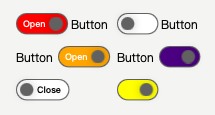
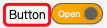
RibbonSwitchButton Light/Dark Style
2 Properties
2.1 isDarkMode
- Description:
bool, Night mode, controlled by the same-named property ofRibbonThemeby default.
2.2 showGrabberText
- Description:
bool, Display the text of the grabber indicator, default text isOpen/Close. - Example Image:
2.3 grabberText
- Description:
string, Default isOpenwhen the switch is checked, otherwiseClose.
2.4 textColor
- Description:
string, The color of the switch’s label text, default iswhitein night mode, otherwiseblack. - Example Image:
2.5 textSize
- Description:
int, The size of the switch’s label text.
2.6 grabberCheckedColor
- Description:
string, The background color of the grabber indicator when the switch is checked, default is#8AAAEBin night mode, otherwise#2850A4. - Example Image:

2.7 grabberUncheckedColor
- Description:
string, The background color of the grabber indicator when the switch is not checked, default is#292929in night mode, otherwisewhite. - Example Image:

2.8 grabberTextCheckedColor
- Description:
string, The text color of the grabber indicator when the switch is checked, default isblackin night mode, otherwisewhite. - Example Image:

2.9 grabberTextUncheckedColor
- Description:
string, The text color of the grabber indicator when the switch is not checked, default iswhitein night mode, otherwiseblack. - Example Image:

2.10 grabberColor
- Description:
string, The color of the grabber indicator. - Example Image:

2.11 borderColor
- Description:
string, The border color of the switch, default iswhitein night mode, otherwise#616161. - Example Image:

2.12 borderWidth
- Description:
real, The width of the switch’s border, default is1.4. - Example Image:
2.13 textBold
- Description:
bool, Display the switch label text in bold, default isfalse.
2.14 textOnLeft
- Description:
bool, Display the switch label text on the left side of the switch, default isfalse. - Example Image:
2.15 showTooltip
- Description:
bool, Display button tooltip, default isfalse.
2.16 tipText
- Description:
string, Button tooltip text.
3 Example Code
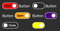
3.1 Switch with Grabber Indicator Text
3.1.1 Code
RibbonSwitchButton{
    text: "Button"
    showGrabberText: true // Display the text of the grabber indicator
    textOnLeft: false // Let the switch label display on the left side of the switch
    grabberCheckedColor: "indigo" // The color of the grabber indicator
}
3.1.2 Code Preview
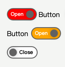
RibbonSwitchButton With Grabber Text
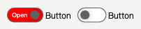
3.2 Switch without Grabber Indicator Text
3.2.1 Code
RibbonSwitchButton{
    text: "Button"
    showGrabberText: false // Do not display the text of the grabber indicator
    textOnLeft: false // Let the switch label display on the left side of the switch
    grabberCheckedColor: "indigo" // The color of the grabber indicator
}
3.2.2 Code Preview
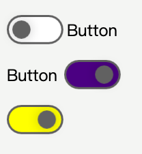
RibbonSwitchButton Without Grabber Text