Button
1 Overview
- Parent:Button
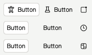
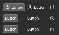
- Demonstrate:


RibbonButton Light/Dark Style
2 Properties
2.1 isDarkMode
- Type/Description:
bool, night mode, default is controlled byRibbonThemeproperty of the same name
2.2 showBg
- Type/Description:
bool, show button background, default isTrue - Demo picture:

2.3 showHoveredBg
- Type/Description:
bool, show mouse overlay background, default isTrue - Demo picture:


2.4 adaptHeight
- Type/Description:
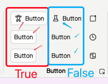
bool, adapt the height of the button to the parent container, default isFalse - Demo picture:

2.5 showTooltip
- Type/Description:
bool, showTooltipfloating window, default isTrue - Demo picture:

2.6 iconSource
- Type/Description:
var, button icon, support input image link (qrc://orfile://) or use embedded Microsoft icons (RibbonIcons) - Demo picture:

2.7 iconSourceFilled
- Type/Description:
var,since the code for the hollow and solid versions of Microsoft icons are not fully matched, if the solid icon is abnormal when using inline Microsoft icons and only using iconSource, please replaceRibbonIconswithRibbonIcons_Filled, just likeRibbonIcons.Home -> RibbonIcons_Filled.Home, and assign the value to this attribute
2.8 imageIcon
- Type/Description:
alias, direct access to button’s image icon object
2.9 ribbonIcon
- Type/Description:
alias, direct access to button’s embedded icon object
2.10 bgColor
- Type/Description:
string,defines the background color of the button, by default it will switch with the light/dark theme
2.11 hoverColor
- Type/Description:
string,defines the color when the mouse over the button, default will switch with light/dark theme and whether to show the button background or not
2.12 pressedColor
- Type/Description:
string,define the color of the button pressed, default will switch with light/dark theme and whether to show button background or not
2.13 checkedColor
- Type/Description:
string,define the color of the button when it is checked, default is same aspressedColor
2.14 textColor
- Type/Description:
string,define the color of the button text, default is black for light theme and white for dark theme
2.15 textColorReverse
- Type/Description:
bool,text color rendering, default isTrue, when the button has no background, if the button is covered/pressed/selected by the mouse, the text color of the button will be lightened to render it as a highlight (only noticeable when dark color is used, this attribute has the possibility to be cancelled)
3 Example Code
3.1 Basic Button
3.1.1 Code
RibbonButton{
    text:"Button"
}

RibbonButton{
    text:"Button"
    showTooltip: false // don't show the button tip floater
}
3.1.2 Code Preview

Basic button
3.2 Basic Button With Icon
3.2.1 Code
RibbonButton{
    text:"Button"
    iconSource: RibbonIcons.Accessibility
}

RibbonButton{
    text:"Button"
    showBg:false // don't show background
    iconSource: RibbonIcons.Beaker
    checkable: true // let it could be checked
}
3.2.2 Code Preview
Basic button with icon
3.3 Icon Button
3.3.1 Code
RibbonButton{
    showBg:false // don't show background
    iconSource: RibbonIcons.Badge
    iconSourceFilled: RibbonIcons_Filled.Badge // define solid icon
    checkable: true // let it could be checked
    tipText: "Button" // define the button tip floater's text
}
RibbonButton{
    showBg:false
    iconSource: RibbonIcons.Clock
    iconSourceFilled: RibbonIcons_Filled.Clock
    tipText: "Button"
}
RibbonButton{
    showBg:false
    iconSource: RibbonIcons.Board
    iconSourceFilled: RibbonIcons_Filled.Board
    checkable: true
    tipText: "Button"
    showTooltip: false // don't show the button tip floater
}
3.3.2 Code Preview
Icon button